Graphic design,
identity development
& typography

Te Taura Whiri i te Reo Māori identity
Brand Identities and style guides
With the success of their Te Wiki o te Reo Māori campaigns and the emphasis shifting to web and social media based outputs, Te Taura Whiri i te reo Māori wanted a fresh and cohesive identity that brought everything together.
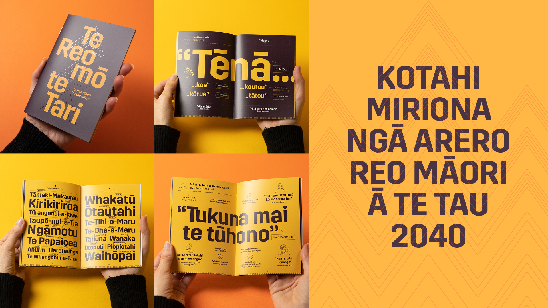
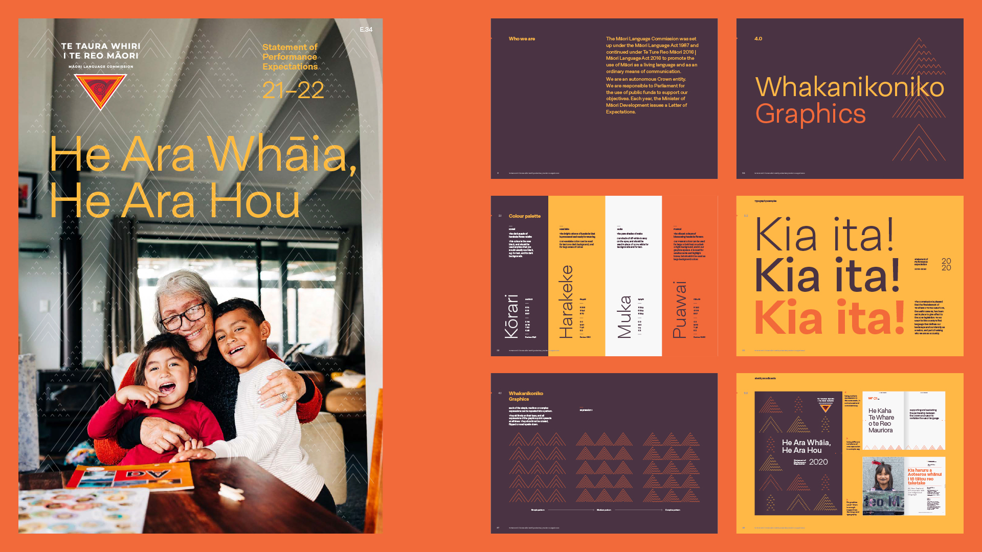
The approach to the new identity was typography-led, to hero te Reo Māori in all expressions of the brand. The grid system was designed to clearly structure information, and allow for large kupu and rerenga kupu to be used in all applications, from annual reports and street posters, to instagram posts.
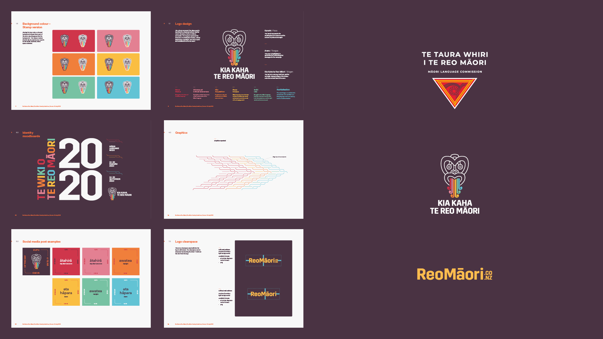
We reworked the iconic Te Taura Whiri and Kia Kaha te Reo Māori logos (the Kia Kaha hei tiki was originally designed by KE Design) for better clarity and impact in a small-screen social media environment, as well as creating a new logotype for the ReoMāori website.
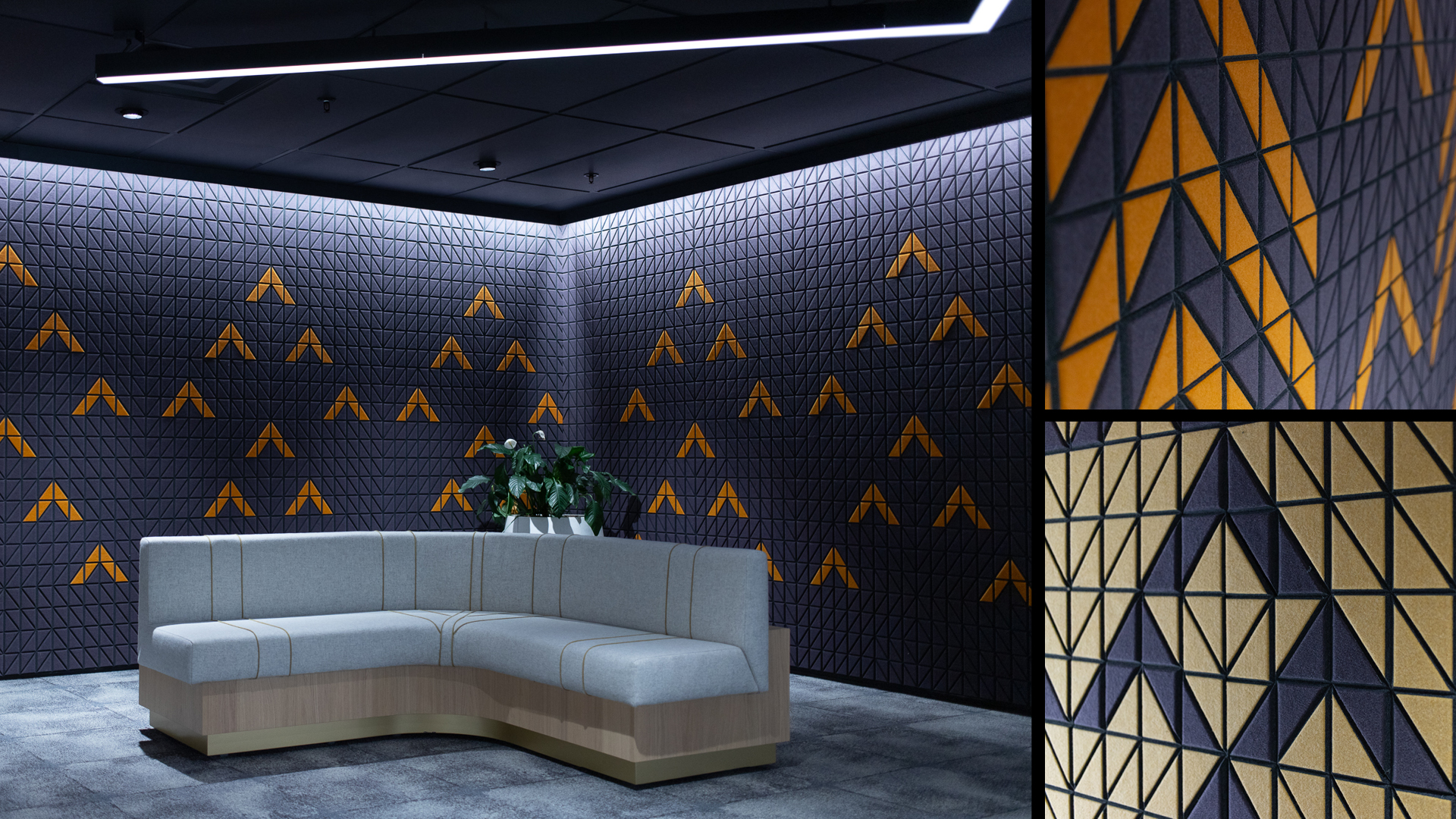
The graphics and patterns are created from the same angle of the niho taniwha in the logo, in a range of different expressions and degrees of complexity. The graphics represent people’s te Reo knowledge going from simple to complex, and the continous strengthening and proliferation of the language over time.
The graphics informed the design of the acoustic panels in the award-winning office fitout done by RGC.
Client: Te Taura Whiri i Te Reo Māori