

Te Mātāwai Identity
Brand Identity and Style Guide
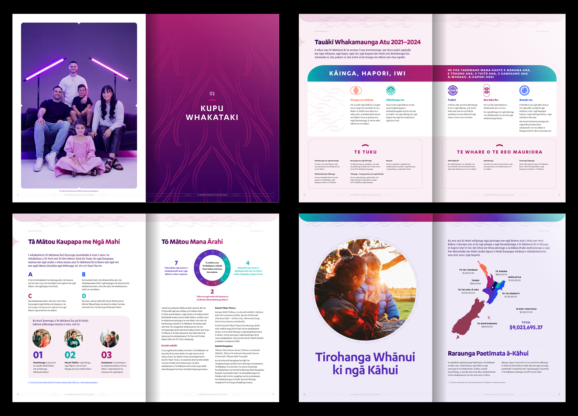
Te Mātāwai was looking to evolve their identity, while retaining their logo and distinctive colours. We developed it by creating a suite of graphics, refining their colour palette and developing a new typography and grid system to organise and present their content clearly and consistently.
The identity graphics represent the interconnected flowing of knowledge to and from Te Mātāwai – the fountainhead or source – and imagine the form of the wake of a marakihau.
The first application we did using refreshed identity was to the 2022–23 Pūrongo ā-Tau / Annual Report.
Client: Te Mātāwai
